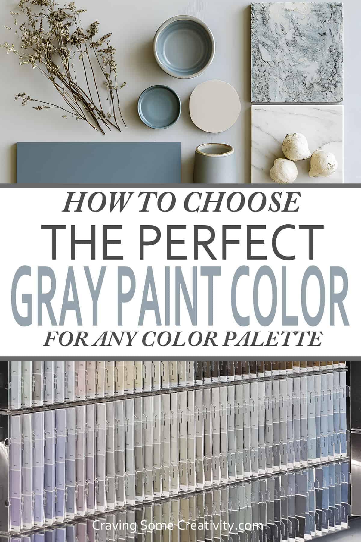
A comprehensive guide to Choosing the Perfect Gray Paint. Learn how to establish undertones, work with paint samples, and avoid common, costly mistakes. Paint your space the perfect shade of gray with confidence.
Remember millennial gray? Those silver and brown-leaning shades were everywhere for a while-and often left rooms feeling a little flat. But gray is still one of the most popular paint choices for a reason: it's timeless, versatile, and can look seriously stylish when done right.
That said, gray is also one of the trickiest colors to get right. I once swatched 22 different grays in our laundry room before landing on a cool shade with subtle blue and lavender undertones-so I get it.
When you nail the undertones and lighting, gray looks natural – layering beautifully with accent colors and providing depth without overwhelming your space. This guide is geared to help you select the perfect gray, to create a space that feels balanced, inviting, and anything but boring.
The Very First Thing to Do
The very first step is to establish your undertone. So how does one go about that?
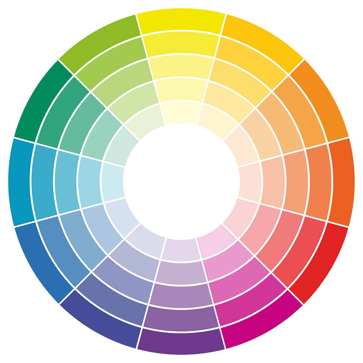
Don’t let that color wheel intimidate you – it’s actually quite simple. First, choose something to build your room around. This can be a textile, a portrait or painting, accent wall material, anything you intend to integrate into your color scheme. While you may have a colorful and eclectic sense of style, a well-designed room features a main color scheme to tie everything together. Feel free to mix it up with color combinations.
Your paint color doesn’t need to be one of the exact shades from your inspiration piece, but it should give you an idea of the tones and areas of the color wheel you’re leaning towards. Choose a grey near the color you’d like to highlight.
For example, our basement bathroom has a rust orange rug as a dominant color while navy and light blue are accent shades. I wanted a calming, lush bathroom so I selected light grey walls with a blue undertone.
How to Know a Paint’s Undertone
A paint's undertone is the subtle hue that casts through beneath the main color and affects how the paint appears in different lighting and next to other colors. While at first glance a paint may appear as straightforward as gray, beige, or white, its undertone can have hints of red, yellow, orange, blue, green, or purple or even a mix of two adjacent colors like blue and green. Undertones are the reason one shade of gray can appear slightly blue while another looks taupe.
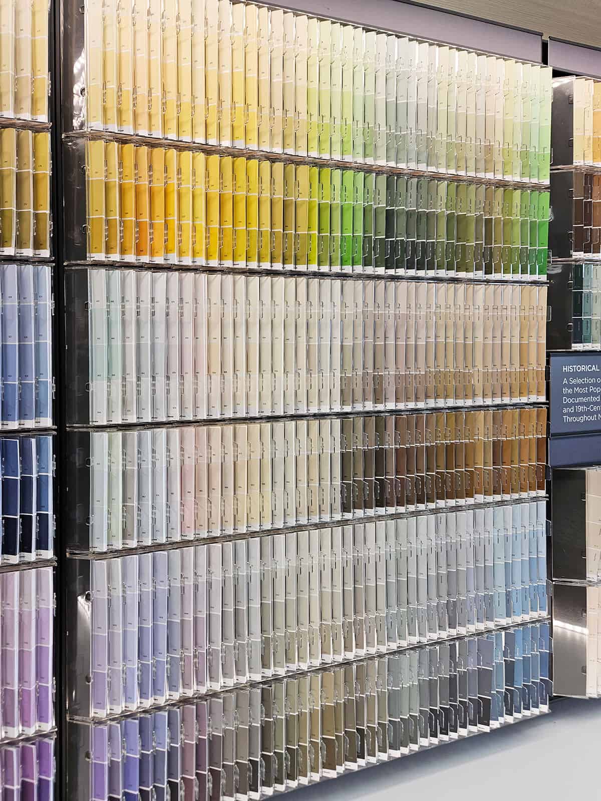
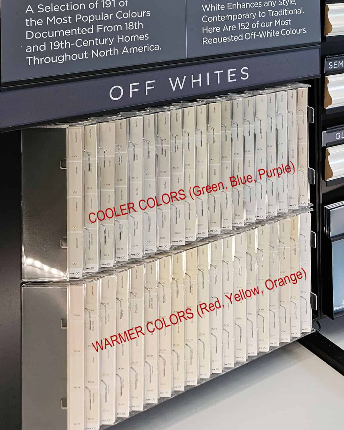
How do we know what a particular paint’s undertone is? The easiest way to take the guess work out is a visit to the paint store. Paint chips are typically lined up by color family. Therefore, a shade of gray-gray undertone is traditionally found next to the greens.
For example, in this photo, you can see how the colors flow from blue to purple to violet on the bottom. The top also flows from green to yellow. Notice how these colors are also next to each other on the color wheel?
The exception to this? Separate displays like off whites or special collections. They are often still organized similar to the color wheel, but another way to determine a paint's undertone is to hold the paint swatch next to a pure white surface-any hidden undertones will become more noticeable. Or place it beside other classic gray samples; a subtle blue, green, or purple tone will stand out when compared side-by-side.
Do some gray paint colors change their perception based on the environment? Yes! Some gray paint colors are total chameleons-they can appear to shift depending on the lighting, time of day, and the surrounding finishes. These grays sit closer to the middle of the warm/cool spectrum and tend to have subtle undertones that aren't immediately obvious until they're up on the wall.
A few examples of chameleon grays:
- Sherwin-Williams Repose Gray
- Benjamin Moore Classic Gray
- Benjamin Moore Balboa Mist
These kinds of light grays are great if you're working with a mix of warm and cool elements in a room-but they also make it extra important to sample gray wall paint in your actual space and lighting conditions before committing.
Can a paint color have more than one undertone? Yes. However, the colors will still be next to each other on the color wheel. For example, you may find a color with a brown (yellow) and green undertone, or one with a peach (pink and yellow) undertone.
Warm vs. Cool Gray
The big takeaway here is to remember that the best gray paint colors are simply a very muted version of a color. That's why the right shade of gray creates a soft perfect backdrop, and why it needs to work with the rest of your color palette.
- Warm GrayS- Notes of yellow, reds, or oranges. You may sometimes see this as greige (yellow undertone) or taupe (brown undertone).
- Cozy, inviting, and pairs well with warm woods and earthy tones.
- Some Popular Examples:
- Sherwin-Williams Agreeable Gray
- Benjamin Moore Revere Pewter
- Cool Grays - Notes of blue, green, or purple.
- Crisp, modern, and works well with whites, blues, and cooler tones.
- Example colors:
- Sherwin-Williams Passive
- Benjamin Moore Boothbay Gray
- Neutral grays – Purple is a mix of red and blue so you can end up with a warm feeling purple. Contrastingly, green can lean yellow or blue, so it may appear as warm, cool, or neutral.
- Some Popular Examples:
- Sherwin-Williams Passive
- Sherwin-Williams Repose Gray (quite the classic)
- Benjamin Moore Stonington Gray
- Some Popular Examples:
In my experience, mixing cool and warm tones brings the most balance to a room. Classic combinations such as navy blue and brass accents or sage green and oak wood demonstrate this principle well.
My kitchen has a cool gray island paired with warm, reddish-brown wood cabinets. The contrast keeps the kitchen from feeling too sterile, creating a warm, welcoming balance.
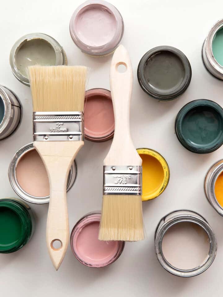
How to Test Paint Samples like a Pro
Once you’ve chosen a direction and narrowed down the corresponding undertones, it’s time to pick samples.
Pro Tip: I do not recommend starting a room makeover with your paint color. Check out our walk-through of how to design a cohesive room to see how to put colors together that work.
Step 1: Gather Up Your Inspiration
Collect samples of items already in your space that you plan to highlight or can’t change. This could be wood furniture pieces such as a cabinet door, a pillow or other fabric, tile or other flooring sample, etc. Head to the paint store, samples in hand.
- Compare your home sample to paint chips to weed out the ones that clearly won’t work.
- Try to look at the samples in natural light – near a window or a slightly shaded area at midday (not very late afternoon, night or early morning) like your vehicle.
- Paint chips may appear very similar because they’re such a small sample size. Remember to note where the paint chip is located to determine undertones.
- Either choose several chips to bring home to narrow it down further or, if you feel confident about your choices, get sample paint pots.
- Pick at least 2-3 candidates, selecting more is fine too.
Step 2: Paint Large Samples
- Paint large sheets of thick paper and hang them around the room. I cut up a poster board to do this. You can also use something like Sampalize.
- I don’t like to paint directly on the walls because the shade could be distorted by old paint color showing through. It’s also good practice to take down any samples of “losing” colors so they don’t affect your perception.
- Hang samples next to coordinating elements such as wallpaper, furniture, or fabric.
- Don't hang samples side-by-side; it distorts color perception. Those samples are competing with each other, and they play dirty.
- Stand both back at least a few meters and up close to get a sense of the color in the room.
Step 3: Consider the Lighting
Check the color at different times of day-gray can look wildly different in natural vs. artificial light.
- North-facing rooms - Cooler light enhances blue or purple undertones.
- South-facing rooms - Warm light makes grays look warmer and sometimes even beige.
- East/West-facing rooms - Light shifts throughout the day-test at different times!
- Contrast– Note that if you have a room that’s currently painted yellow and you use a cooler color, that contrast is going to make the undertone stick out more. The lighting in your room is bouncing your current wall color onto the samples too. Zone in on that sample color and then close your eyes to visualize it around the room.
At this stage, you’ll know if you’ve selected the one. If none of the paint samples are pulling you in or you’re feeling a bit hesitant, that’s completely fine. Even after decades of experience, I’ve had projects where I neglected to consider some detail and had to forage for more samples.
What NOT to Do
- Don't Choose Based on a Small Paint Chip - Always test a large swatch on your wall to see how it looks in the actual space and lighting. Read Easy Tips and Tricks to Choose Paint Colors for more pointers.
- Don’t pick your paint color first. Find your inspiration piece first (what you want to showcase) whether it’s a large piece of furniture, wallpaper pattern, or textile. Not sure where to start? Check out 5 ways to start a room makeover.
- Don't Rely on Online Photos Alone - Colors can look drastically different on screen than in person due to lighting and monitor settings.
- Don't Forget Light - Hang your sample in multiple places and check throughout the day. Natural light, artificial light, and sun direction each affect pigment.
- Don't Choose a Color in a Hurry - Take your time testing and comparing options before making a final decision.
- Don't Stick to One Sample - Test at least two or three shades to see how they perform in different areas of the room.
- Don't Forget the Finish - The paint finish (matte, satin, gloss) affects the color's appearance, so test that too if possible! Generally speaking, the more shine, the more depth or darker a color may feel.
You’ve Got This!
Finding the right gray might take some trial and error, but when it all comes together, it's totally worth it! A little planning, some well-placed inspiration, and a lot of paint swatches can make all the difference in creating a space that feels just right.
Have you tackled the challenge of choosing a gray paint? Share your success stories-or your funniest gray paint disasters-in the comments!
Grab our free series "Weekend Home Projects that will Transform Your Life" Sign up below to receive updates including free printables, organization tips, home improvement projects, recipes and more! |
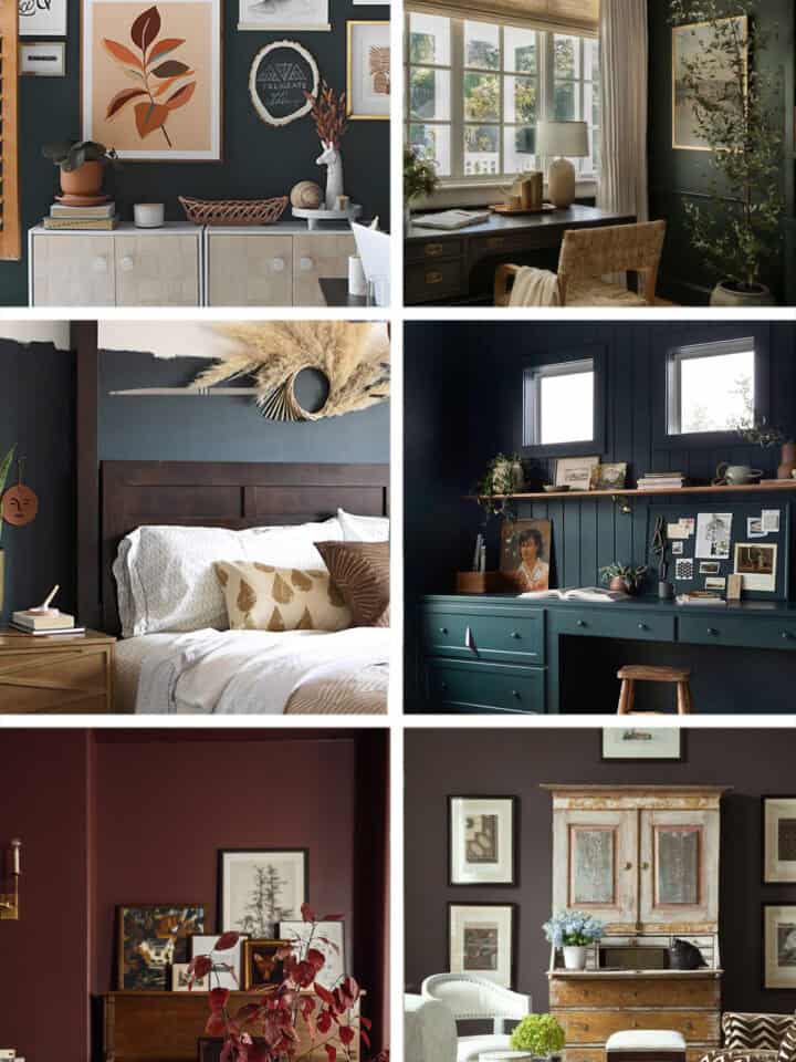
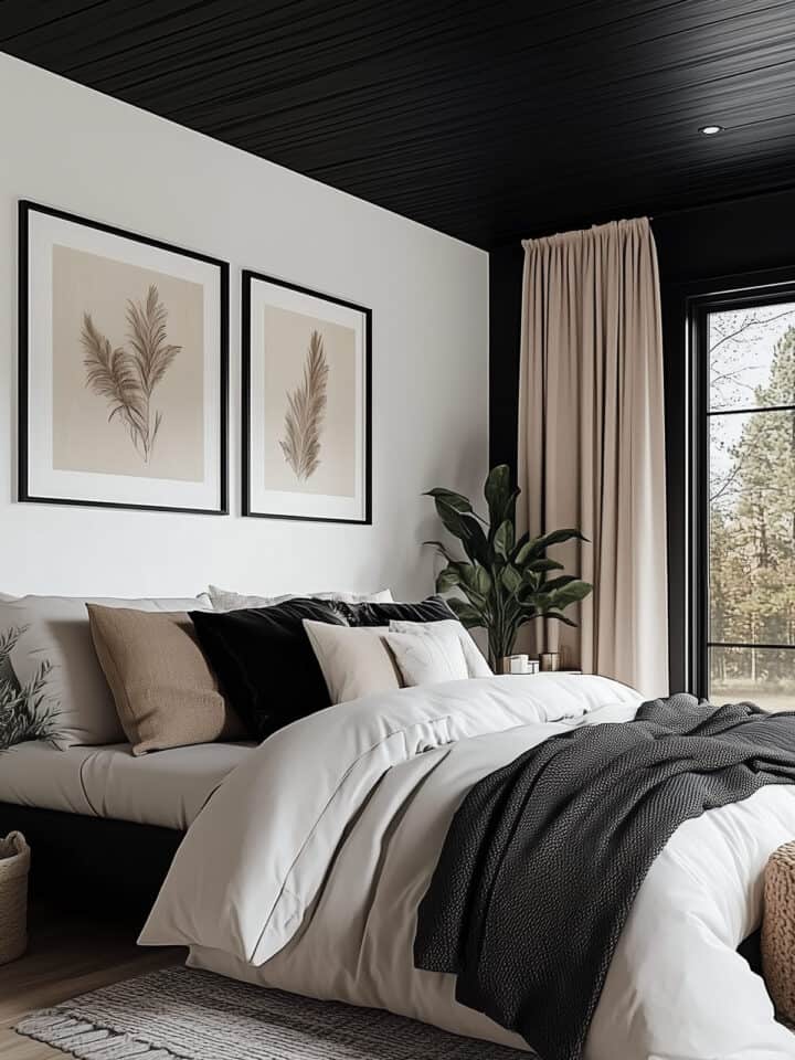
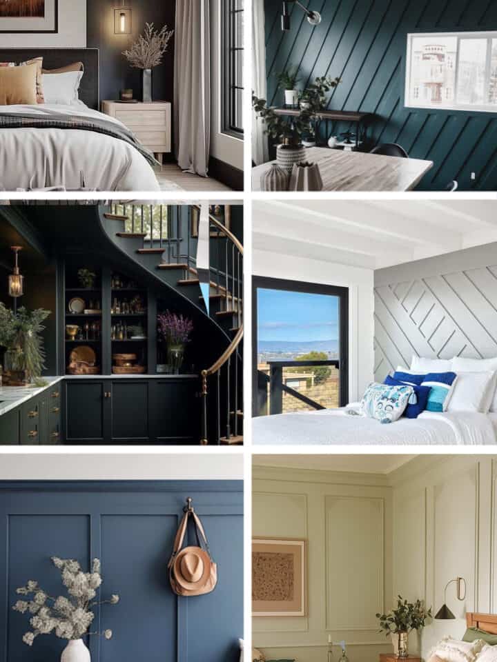
More Wall Color Inspiration
PS I love seeing your creations! Be sure to take a photo and tag #cravingcreative on Instagram! You can also stay in touch with me through following me on Instagram, Pinterest, and subscribing to the newsletter!
Leave a Reply