Take a behind-the-scenes look at how we created a cohesive home interior color scheme for our basement-complete with practical tips to help you choose a color scheme and paint, no matter your style, space, or starting point.

Choosing the perfect paint color starts with a cohesive color palette-but where do you even begin? In this step-by-step guide, I'm sharing the full behind-the-scenes journey of how we landed on the right color palette and paint for our basement. From using what we already owned to testing swatches, this is real-life color planning with all the highs, head-scratching moments, and a few good laughs along the way.
Let's just say it started with a couple of bachelor pad holdovers and ended somewhere between a faux brick wall and 50 shades of gray paint. If you’re working with mixed styles or unexpected constraints, this post will help you pull it all together with confidence-and maybe even a little fun.
The Inspiration
For this, I followed my tips on Five Ways to Start a Room Design pretty faithfully. These have certainly never failed me!

First up, the non-negotiables: two prints my husband has had since his freshman college. They're a little kitschy, a little unexpected-but personal touches are what give a space soul.
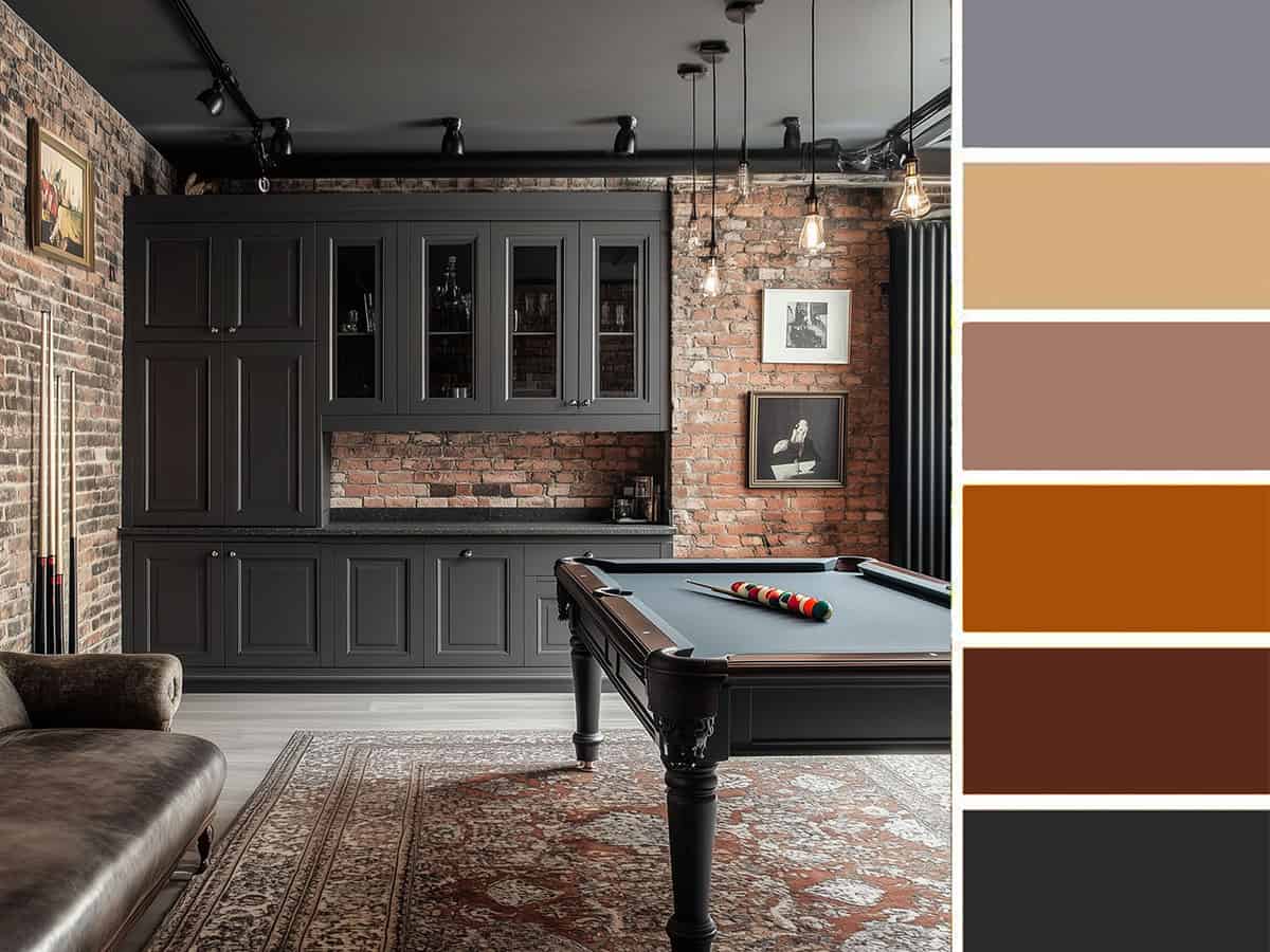
Next, we looked at the layout and what we desired for the space. We knew we wanted a full-fledged hangout zone: pool table, dartboard, built-in wet bar, and a cozy corner for movie nights. My inspiration came from the moody charm of British Victorian pubs we visited in England-warm, relaxed, and just a little bit sultry. The style felt flexible enough to capture the vibe and stay on budget, while also working with sophisticated versions of the colors in the prints.
Our Project Focus List
Since this space is pretty open, there are a few focal points we started with. Some decisions were instinctive, and we started with the colors with the least amount of choices. So, we rolled up our sleeves and dove in headfirst into these projects:
- Installed plank vinyl flooring.
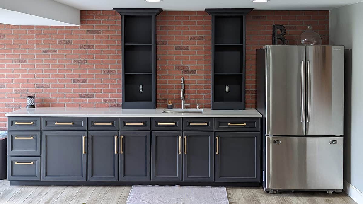
- Built wet bar cabinets and installed a faux brick wall.
- Upgraded the outside entrance with French doors.
- Painted the cabinetry in a rich charcoal black gray.
- Installed crown molding and added picture frame molding.
- Purchased a pool table from Facebook Marketplace.
- Purchased a rug to coordinate/tie into the brick wall.
- Reframed those prints.
Finally, it was time to pick a paint color. I choose a wall color usually last because I have unlimited options and can coordinate to something in the room like the rug or the brick wall. At this stage, I knew medium gray was the best fit for this space. Now, how to sort through all the shades of gray…
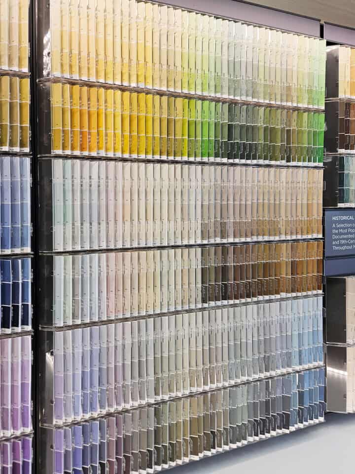
How to Pick Paint Like a Pro
I have a full guide on how to choose the right gray paint, but this walks you through the process of making everything coordinate.
One of my favorite design tricks is mixing warm and cool tones-it creates instant balance. Think brass and navy: always a winning combo. For our basement, I leaned into grays with a violet undertone. A cooler violet undertone pairs beautifully with the warmth of our red brick wall, tying everything together without clashing.
That said, I don't limit myself when choosing swatches. I like to bring in as many materials as possible to see how they play together. When I designed this bathroom with tile, I showed up with a brass light fixture and a painted vanity door. For the basement, it was a cabinet drawer front, a piece of flooring, and a small brick sample-all in tow to the paint store.
Pro Tip!: Always check paint swatches in natural light. Try near a window around mid-day, or step outside with your samples to see how everything looks together in the shade.
The Gray Contenders
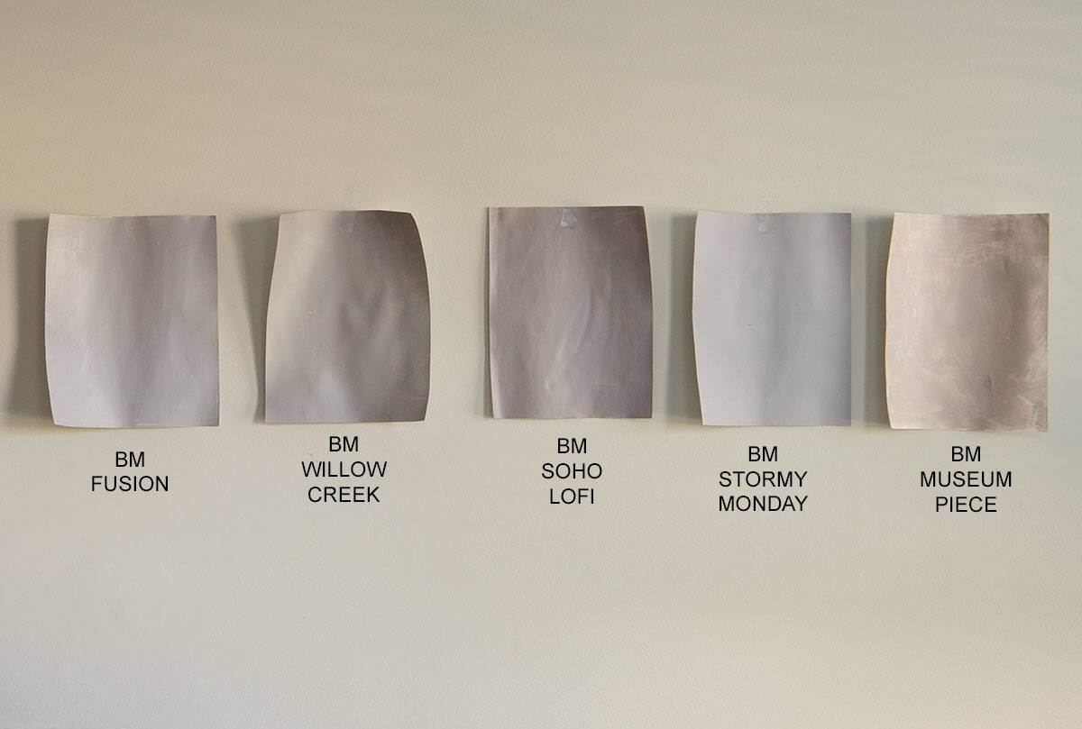
I narrowed it down to 5 shades to try. I painted each on a full sheet of cardstock (thicker paper). The paint is applied in a thin layer to keep the paper from curling too much.
Typically, I wouldn’t line up swatches so close together. However, I want to demonstrate how similar, yet different these shades of gray appear on camera. At first glance, I knew the Museum Piece was out; I was leaning towards Soho Lofi.
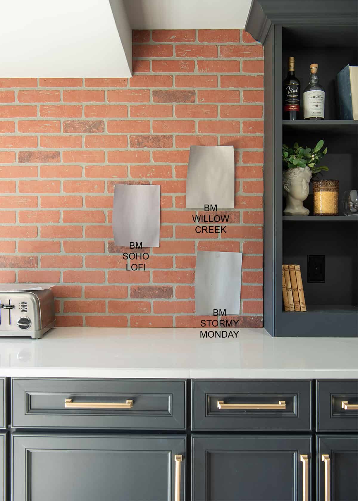
Once I saw the Soho swatch next to the faux brick and cabinets, I wasn’t a fan. BM Willow Creek matched the gray in the brick the best and pulled out as the front runner.
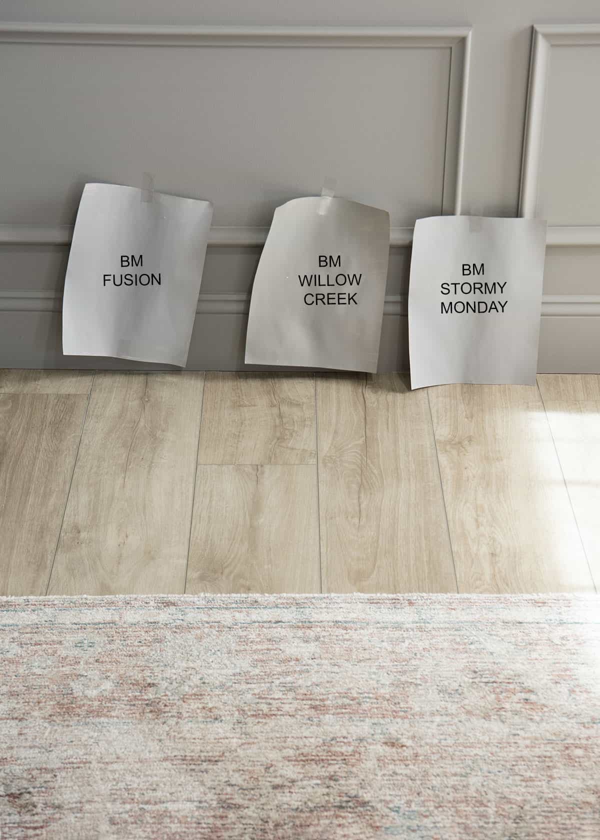
I checked in throughout the day, in various lighting conditions, slowly weeding out samples. This small area next to the rug was how I made my final conclusion. In this photo they look lighter and more alike than they do in person.
What do you think we chose?!
The Results Are In
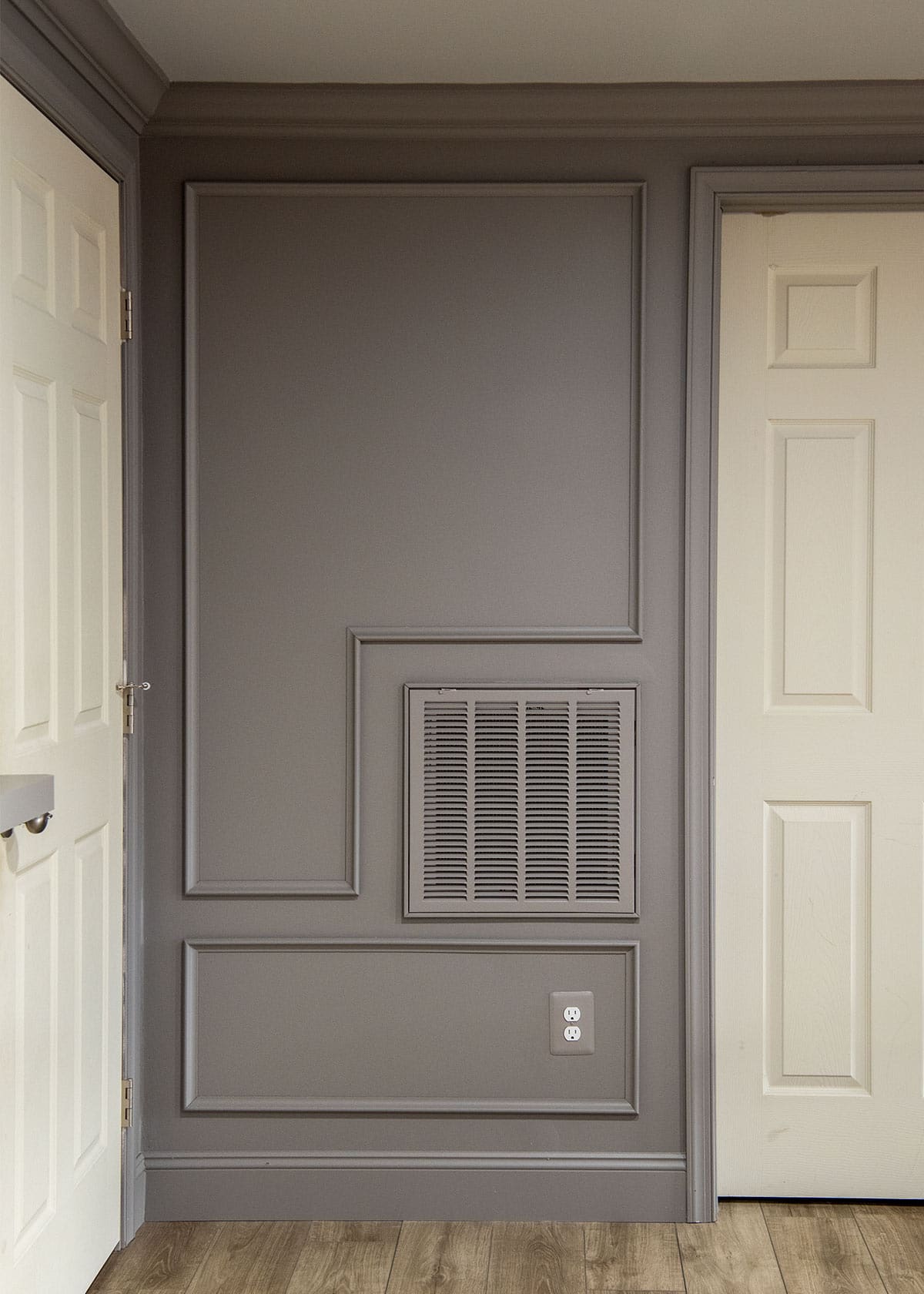
Willow Creek was the overall winner! My original plan was to color drench the entire basement, but hubby was concerned. We have low ceilings and it’s a large, long space. So, we compromised by choosing the slightly lighter shade on the color card, Smoke Embers, to paint the ceiling.
Seeing this room come together has been so satisfying. I still have some details to finish like doors and hardware, but this project is in the home stretch! Have you ever gone through the struggle of making a cohesive scheme? Let me know in the comments-did you nail it on the first try or encounter surprises along the way?
Grab our free series "Weekend Home Projects that will Transform Your Life" Sign up below to receive updates including free printables, organization tips, home improvement projects, recipes and more! |
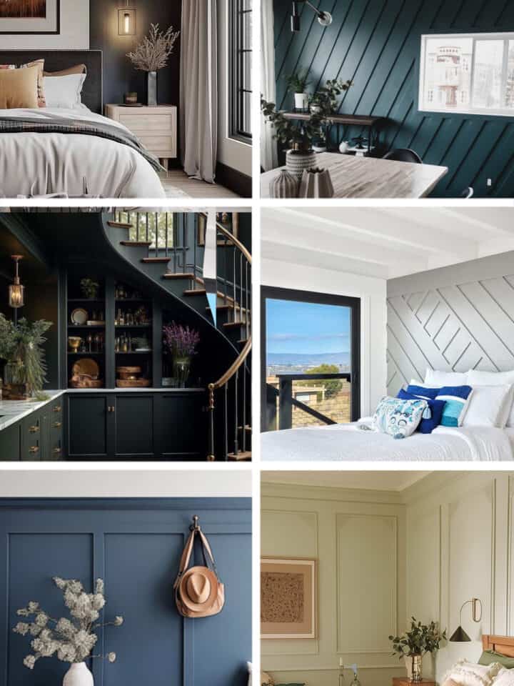
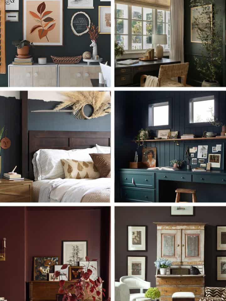
More Painting and Wall Ideas

PS I love seeing your creations! Be sure to take a photo and tag #cravingcreative on Instagram! You can also stay in touch with me through following me on Instagram, Pinterest, and subscribing to the newsletter!
Leave a Reply