Color drenching is a decorating trend developed to create a rich, immersive space without overwhelming the design. Whether you’re trying to pump up the drama, dial up the intimacy, or simply want a seamless look, this technique will transform a room. Learn what works, what doesn't, and color ideas to make this bold trend feel just right in your home.

With the wet bar cabinets painted and the faux brick wall installed, it’s time to get the rest of the basement remodel to match the vibe. Our goal has always been to make this space feel cozy and cohesive, while highlighting all the rich features. That’s how the color drenching trend first caught my eye.
It's immersive, slightly moody, and undeniably impactful. This trend delivers, enabling homeowners to create the illusion of taller ceilings, add a dash of boldness, or wrap a room in an ultra-cozy vibe like we did. But it’s not for everyone or every room. Let me explain…
What is Color Drenching?
Color drenching is a home design trend where a space is sheathed, or drenched, in one color. The walls, ceilings, trim and moldings are all soaked in a single color for an immersive experience. No contrasting white or wood trim. No ugly radiators sticking out. BIG impact. A color-drenched room is sort of like a cocoon of color. From darker hues to bright bold colors, any color can work with drenching.
Although not necessarily a new technique, color drenching is an interior esthetic that’s leaving the confines of powder rooms and gaining popularity.
What are the Rules?
As with any design trend, “rules” can be bent to best serve your space. However, it’s a big commitment, so there are some things to keep in mind.
- Take extra care to choose the right color. What mood you are hoping to invoke? This trend can run the gamut from light, spacious colors to deep moody paint colors like these that feel more intimate.
- Consider the Paint’s Finish. Use the same color, but different finishes or sheens. A dead flat finish on the walls and a semi-gloss on the woodwork, for example. The slight difference adds dimension and prevents a room from feeling drab.
- Test Lighting. Factor in the effect of natural vs artificial light. Deep hues could feel overwhelming if used in a large space with limited light exposure. However, color drenching with a soft hue can make spaces with no natural light, like a basement bathroom, feel taller.
- Should you extend to furnishings & accessories? I personally love using contrast to highlight features and you should still create a color scheme. However, drenching items like radiators, ventilation covers, and built-ins can make them recess into the background, thus highlighting other features that add visual interest.
- Balance with Texture & Materials: Dimension is the trick with this technique. Choosing a room with existing architectural details, such as diy wainscotting, keeps depth and creates subtle sophistication.
Pro Tip: If you want to try this trend, do keep in mind that you may end up painting things that aren’t usually painted. Beyond built-ins, I have posts on painting ventilation grates as well as painting outlet covers and light switches, etc. It’s up to you how far you take it.
The Don'ts of Color Drenching
It’s important to note that color drenching is only as effective as your commitment to the scheme; being partially invested could produce confusing results. No room is off-limits but understand that it’s not as easy to change colors if your style changes.
- Skipping Sample Tests. Paint several large sheets and hang them around the room at different times of the day to get a better idea. If you’re deciding between paint colors, read my no-fail method for picking paint colors.
- Not adding contrasting color. Color drenching blurs the line from floor to ceiling creating expansiveness, but it needs other contrasting colors to pull it together. Examples are wood tones with forest green, black and white, dusty blue and gold.
- Open Floorplans. This technique works best in defined spaces, so it’s not about the size of the room. An open concept home may not be ideal. If there’s no discernible stop point, it could feel overwhelming.
- Overdoing It in Small Spaces. Color drenching techniques can make a room feel spacious & airy or intimate & inviting. The overall effect depends largely on the paint that’s selected. If you’ve got your heart set on using deep hue in a small dimly lit space, I recommend adding more light fixtures and using paint with a higher sheen like satin.
Rooms That Got It Right
The best thing about color drenching is that works with a variety of design styles, from modern urban to Victorian or Georgian. Here are a few examples to show you how to this method looks when applied in real life spaces:
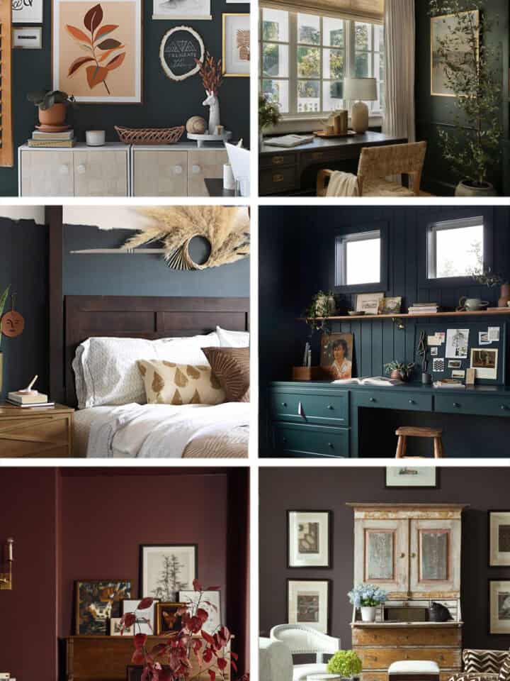
Moody & Sophisticated: Deep green or navy in a study or cozy basement. Dark colors can be relaxing or high contrast for vibrancy. In this example, the baseboards and window frames are high contrast, so the effect is not as stark.
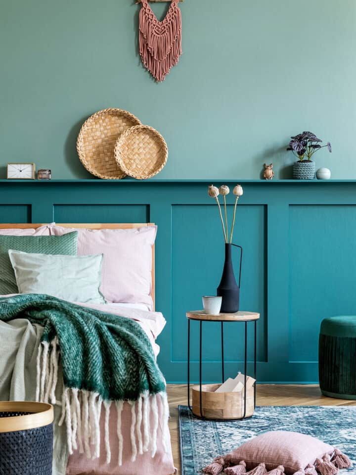
Soft & Airy: Blush pink or warm beige in a bedroom or living room for a calming effect. If your overall goal is to create the effect of an enlarged space, choose something more neutral or perhaps a pretty pastel. The moulding and radiator take a backseat to the lovely art display in this example.
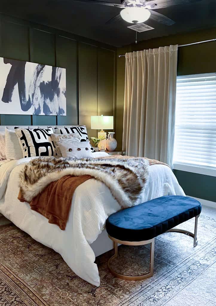
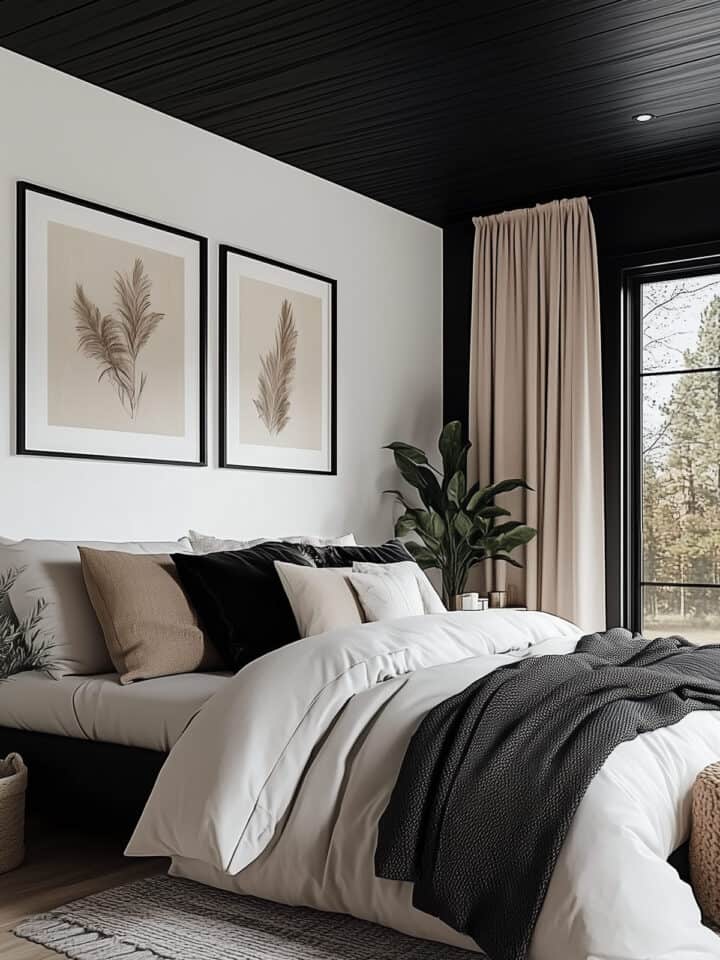
Dramatic & Luxurious: Charcoal or rich jewel tones in a dining room or powder room are chef’s kiss. The bedroom color palette above works for those who like a luxurious, rich bedroom to snuggle into.
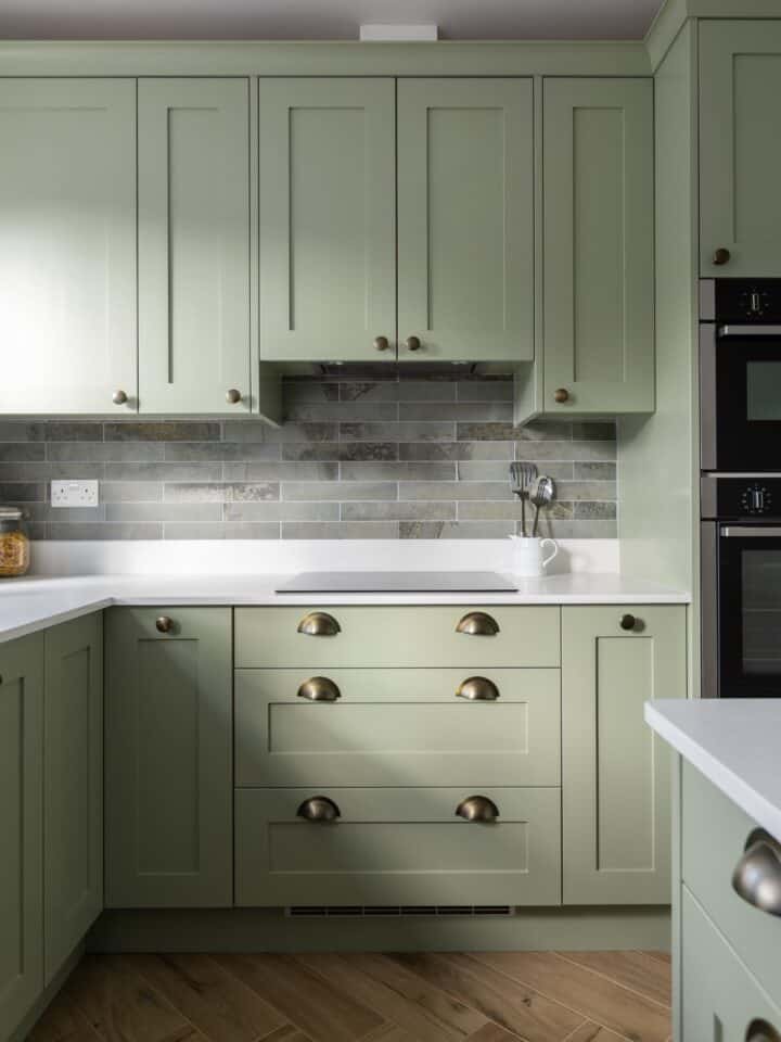
Earthy and Serene. Natural inspired hues like green and blue are especially excellent for color drenching because they make you feel enveloped and fresh, like a spring rain in the forest. The different paint finishes of the woodwork add subtle shine too.
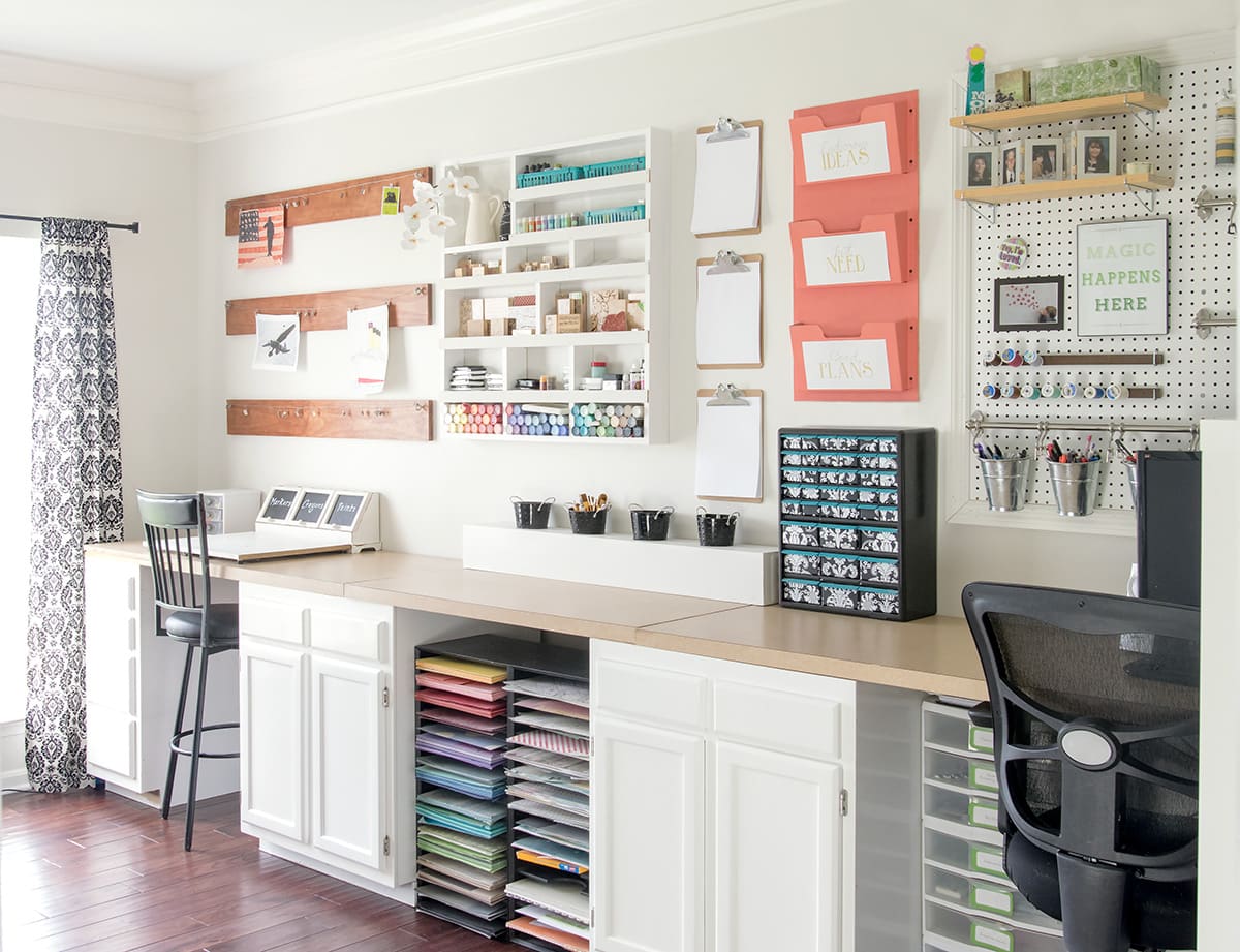
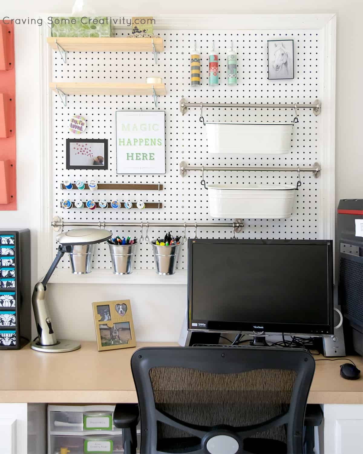
As a Backdrop. I wouldn’t necessarily consider my colorful craft room storage to be an example of colour drenching because it’s white. However, it illustrates that using one color across everything can be used to highlight other accents. For example, I use the white to create a blank canvas for my colorful craft items stand out.
Immerse yourself in a mood. The matte finish of the green paint above has a velvet effect on the walls. Without being overly dark, everything feels calm and studious.
More Painting Techniques for Interiors
Considerations from Our Project
While the fundamental idea is that the trim, ceilings, and walls are all one color, the implementation can vary for individual spaces.
Our basement is a fairly open space, so we elected to paint the ceiling slightly lighter than the wall. Sometimes also called half-drenching or double drenching, this variation is where two similar tones are used in the same room.
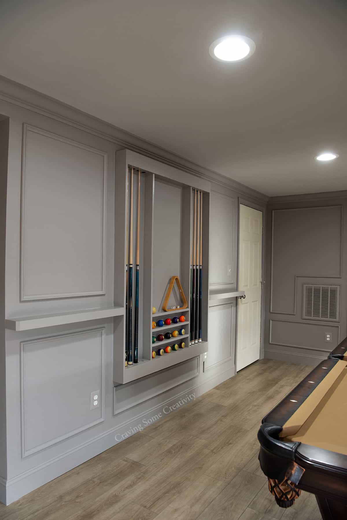
We spent a little more money to paint the walls and trim in a durable trim paint in eggshell. I painted the entertainment center, pool rack and shelves, and outlet covers with Benjamin Moore Advance in Satin and a topcoat of acrylic polyurethane. Although I haven’t painted the doors, they’ll be covered with an appropriate durable paint too.
Pro Tip: For best results, choose the correct paint for the surface you’re painting. For example, select a furniture paint for built-ins or a more durable paint for metal covers.
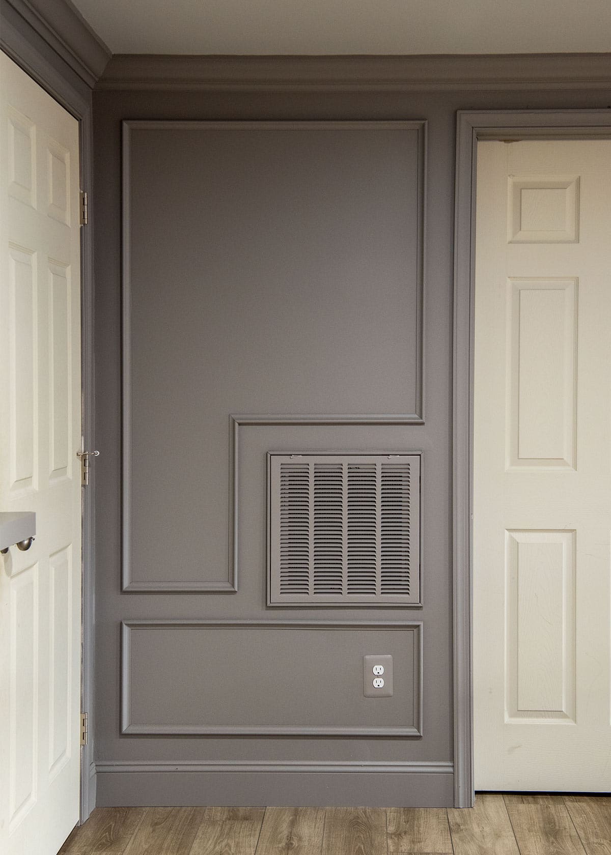
Another thing that you may notice is that outlet covers, light switch covers, and vent covers are painted the same shade as the walls. The covers were all hand painted. This is what I mean by this design trend being quite the commitment. I don’t know that I will change the outlets themselves to a closer grey yet, but I wouldn’t recommend painting.
Overall, this effect is exactly what this space needed. It’s perfectly cozy and welcoming. It helps to put the focus on the features of the room and simplifies the design. What do you think? Do you have the right room for this trend?
Grab our free series "Weekend Home Projects that will Transform Your Life" Sign up below to receive updates including free printables, organization tips, home improvement projects, recipes and more! |
More Decorating Ideas
PS I love seeing your creations! Be sure to take a photo and tag #cravingcreative on Instagram! You can also stay in touch with me through following me on Instagram, Pinterest, and subscribing to the newsletter!
Kelly says
Can you share the Benjamin Moore colors you used for your basement along with the finishes? We are looking to do something similar!
Rachel says
This mancave makeover post is where I show all the ideas we incorporated into the finished basement has a lot more detail. For the walls, the paint color is Willow Creek by Benjamin Moore and the ceiling is smoke embers. All of the paint colors we used in the house are on our home tour page here. I hope your project goes super smoothly!