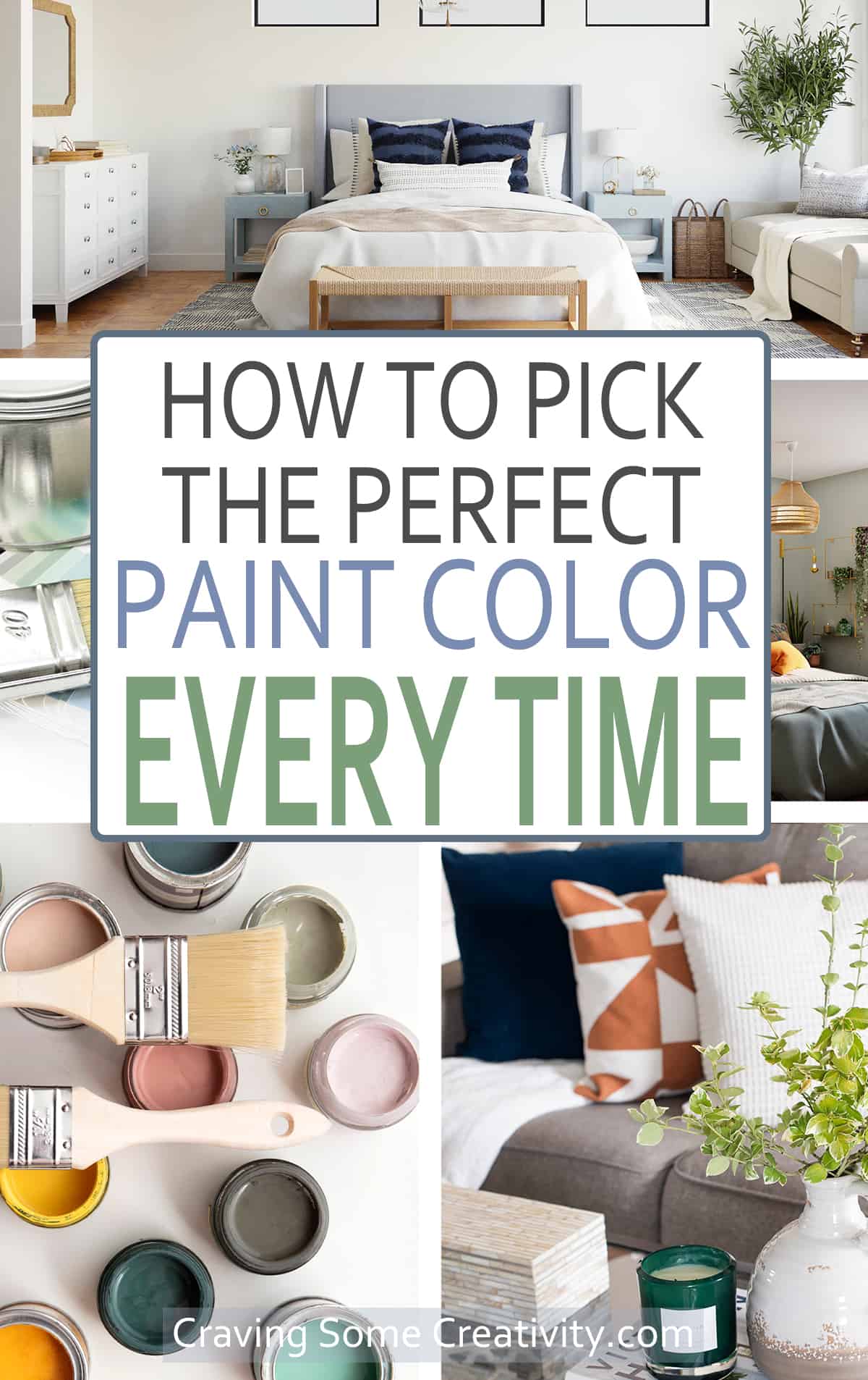
Ever chosen a wall paint color, only to hate it?! Demystify choosing paint colors with this actionable step by step guide to creating a cohesive Whole House Color Palette. These tips and tricks act as a money and time saving blueprint to make the right choice!
I have a slight obsession with the ease and budget friendly, eye-popping transformation that a fresh coat of paint can bring to a space or a once loved piece. Over the last 15 years, I have renovated and designed homes with new paint finishes – everything from Saran wrap decorative finishes to popcorn ceilings and found many painting tips and tricks along the way.
I've learned how to avoid paint color mistakes in a practical way and today I am going to share some of my tips for how to choose paint colors for your home interior including kitchens, bathrooms, bedrooms, and more. You don’t need to know color theory or have spent countless hours in interior design classes to get the color you envisioned!
Why Choose a Paint Color Palette Ahead of Time?
To really get a designer feel, I generally decide an entire color palette for a space before slapping paint on a wall. This means that I decide all the colors before putting paint on a wall. Inspiration for a color pallet could come from a fabric like a bedspread, a photo, or putting a stack of paint colors together.
Especially with today’s popular open concept homes, choosing a color scheme has so many benefits:
- It acts as a blueprint for choosing any furniture or decor for your home, which makes for less stress and easier decisions.
- Save money and time by choosing the correct items the first time.
- It makes the whole space cohesive, and you aren’t stuck trying to find something to match.
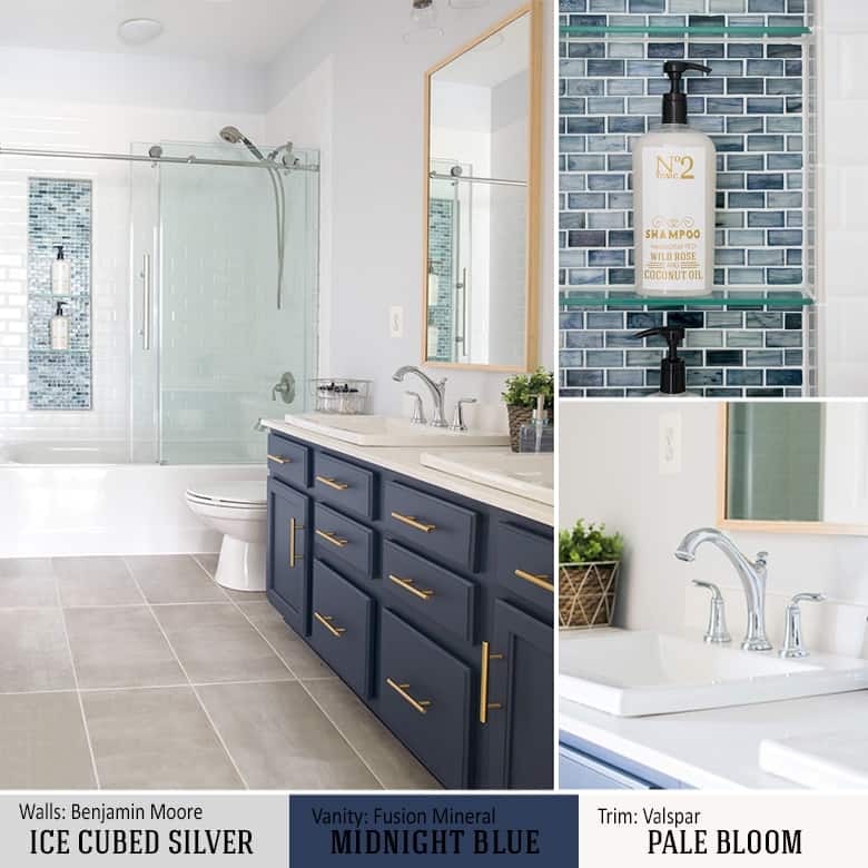
You don’t need any fancy software either, nor do I actually recommend it! Here is an example of how I chose all the colors and finishes for our bathroom remodel.
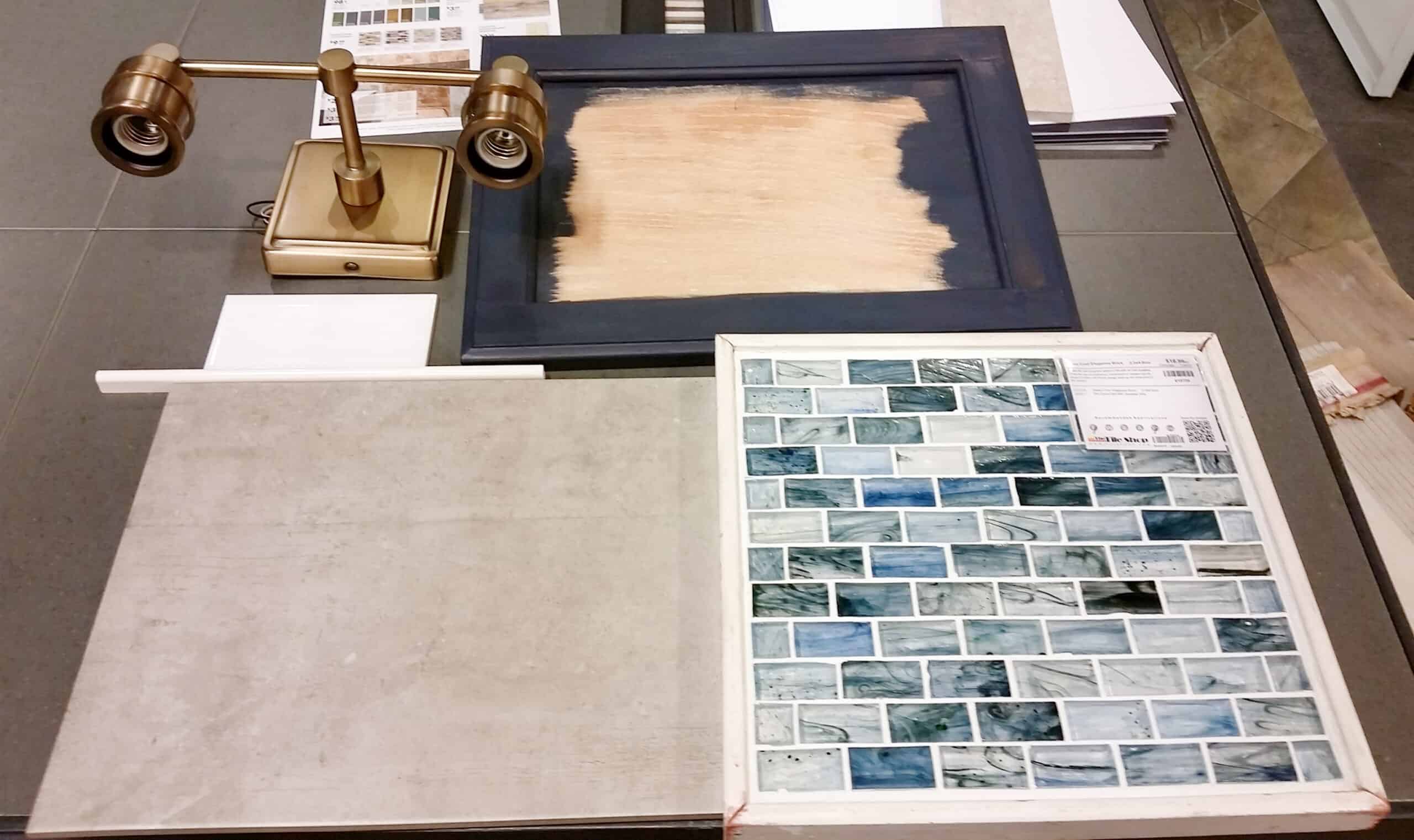
Which came out exactly as I thought it would:
Are Accent Walls Still a Trend?
Yes! Trends come and go, and while the idea of an accent wall faded a lot during the 2010s, they are appreciated once again – we just think of them in a different way.
A feature wall doesn’t just have to be a splash of bold or moody accent colors in an otherwise neutral room. It’s a wall that showcases something about the room that you want to show off. We painted a striped wall in my son’s bedroom, for example, to balance the room and color. You can use geometric patterns, plant walls, or even a collection of your favorite artwork.
Where to Start
1. Choose Your Vibe
I recommend doing a quick brainstorm to determine the mood and ambiance you're trying to achieve. Burnt Orange may be your favorite color but if you are looking for a serene bedroom, orange may not be the go-to choice.
Start by sitting in the room for a while and just stare. What do you want this room to reflect? – Energy? Comfort? Warmth? Colors and your associations with them very much contribute to your emotional state.
I am not saying that if you want a room to reflect a sunny disposition, you should choose yellow. However, it is something to consider when choosing your paint colors and overall color scheme. Here are some ideas:
- Calm and relaxing (for most, this would be greens, whites, taupes, or blues like hues that you find in nature).
- Warm and welcoming (beiges, soft colors,
- Fun and Bold (bright colors)
- Neutral and cozy
- Light and airy
2. Color Theory and Pyschology
No, I am not about to pull out a color wheel and bore you with lengthy discussions about complementary colors vs monochromatic. The important thing to remember here is that color associations are personal and different for everyone. I am famous for naming colors by my associations – the crest toothpaste bathroom, the pumpkin pie house, grandma’s muumuu lavender. Shudder.
Therefore, even if you find an inspiration piece, pay attention to the colors and use them in appropriate doses. If your fabric has a purple you detest, you don’t have to use it on your walls! It can be an accent in another place.
2. Working with Fixed Items
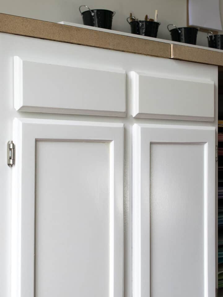
Fixed items are things already in your home that won’t be changing – floors, cabinets, large pieces of furniture you don’t want to replace. Trim can also fall into this category if you do not plan on repainting all of the trim. You will need to incorporate (not necessarily match!) these colors into your overall design, so do keep them in mind.
Pro Tip: Choose your inspiration piece first – a bedspread, a piece of art, or upholstery like a multi-colored rug before your paint color. You may find it impossible to find the right fabric to match paint after the fact.
3. A Photograph
When working with clients or friends for home improvement projects, I always ask for them to find 3-5 photographs of rooms that inspire them and to tell me why. The answers have surprised me more often than not.
First, this exercise makes them think through to the end goal, not just the current project.
Second, professional photographs are going to have that cohesiveness and lighting that we want.
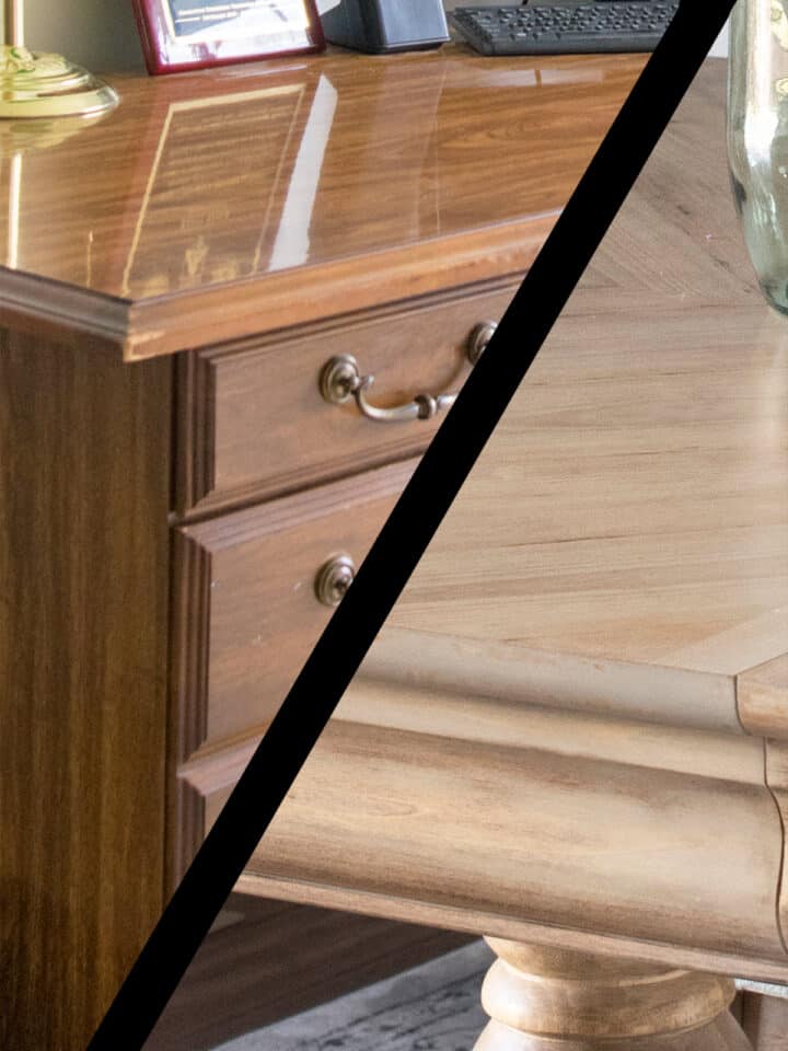
4. Understand Undertones
Truthfully, all paint colors are blended with other colors. While the primary color might be blue, the colors blended in are known as undertones. These undertones become more apparent the larger the painted area, which is why you may end up with a hue you didn’t expect. But let’s fix that!
A warm paint color will have an undertone of a warm color, such as yellow or red.
A cool paint color will have an undertone of a cool color, like blue, green or grey.
How do I find the undertone of a paint color? This is actually easy. In the store, pay attention to the colors the swatch is next to. If the nearby colors look red, then your swatch will also have varying degrees of red undertone. You may not see the undertone in the swatch, but you will in your home.
How To Pick Paint Colors Step by Step
Paint colors won't necessarily look the same in your home as they do in photographs and especially in stores. If you have a few color ideas, this is my no-fail method for picking paint colors.
- Narrow your color choices down to 2-5 colors. Never choose a color at the store.
- Get paint samples. You will be surprised at how different a sample can will look from the swatch. Never choose a color from a 2×2 swatch.
- Paint a posterboard or large piece of cardboard with the paint sample. Hang it around the room to see if you like it in different areas and lighting situations (sunrise/day/night).
- Pay attention to color reflections. For example, if I have a yellow room, that yellow is reflecting onto the paint sample, so it may bring out strange colors. I also hang my posterboard next to fixed finishes (trim, furniture, etc) to make sure they work together.
- Dark vs Light. If you are significantly changing the tone, keep in mind that a dark color will be even darker, and a light color will be even lighter when the whole room is painted. A vibrant color will be even more bold.
Choose the Right Paint Sheen
In addition to the tips above, the right sheen is very important. The shinier the paint, the more durable it is generally. Flat/matte will scruff more easily and is harder to clean without rubbing off paint. Here is a good guide for where and when to use different sheens:
- Gloss or High Gloss – The most reflective sheen. I don’t recommend this for walls as it is terrible at hiding even slight imperfections and it detracts from other items in the home you may want to showcase.
- Semi-gloss / Satin – I will lump these two together even though they are considered different sheens. I do this because some brands are much shinier than others. Semi-gloss should be shinier than satin, however. Semi-gloss is good for trim and cabinets, although I use Satin personally. It’s also good to use satin paints in kid’s rooms and high traffic like hallways or moisture prone areas like bathrooms and kitchens.
- Eggshell – This is generally my go-to. Eggshell bounces light without being reflective, is more durable than flat, and generally the most livable of sheens.
- Flat or Matte – This one can be tricky because I know many who love the aesthetic of flat, brightly colored paint. Flat is the hardest to clean and may soak up food stains or spills. I would keep it to rooms where walls won't be touched much, like large guest rooms or open spaces. Do not use in moisture prone areas like bathrooms.
***Pro Tip: Benjamin Moore has come out with matte paints that are great in bathrooms. It is called Aura and it is more expensive, but I really recommend it! It is easy to clean, doesn’t get water streaks from showering, and is beautifully durable from marks and scuffs. I don’t think it is necessary in living rooms or lower traffic areas so you can save a bit of money there.
The 10 Biggest Mistakes
- Bases are not the same – If you purchase BEHR paint and then decide to buy another can of the same color in Valspar, you will find that the colors do not exactly match. Each brand of base is not the exact shade of white and, thus, your paint will be tinted slightly differently.
- The shinier the paint, the more durable it is generally. Flat/matte will scruff more easily and is harder to clean without rubbing off paint. For trim or high traffic areas such as the kitchens and bathrooms, I use at least a satin.
- The lower the sheen, the easier it is to hide imperfections in your wall, like bumps or places that weren’t sanded perfectly. Flat is going to hide best, while high gloss will hide least.
- You will see variance between a gallon and quart size. This is because the ratios of color to base may not be super exact between can sizes, even with fancy computers. If you need just a bit more paint, I generally recommend buying that gallon rather than a quart.
- Many paints today include primers in them. However, if you are painting walls for the first time or painting walls that have a lot of damage, it is still recommended that you prime them separately. If you’ve filled holes in your walls with spackle, prime those spots to prevent flashing.
- Avoid custom mixing colors. From experience, it is almost impossible to match a custom mixed color if you want to repaint another room or need to touch up in a few years. Even having the barcode or recipe may not save you.
- Purposefully choose a trim color. Gather all of your home’s paint colors together and choose the best trim color that matches all of them – even white. There are many, many varieties of white and choosing a particular tone will do wonders for bringing out the best in your wall color. You will thank me later!
- Don’t ignore lighting. Color looks drastically different in different lighting situations.
- Don’t be afraid to mix cool and warm tones. My favorite color combinations have both a cool and a warm. Dark blue and brass. Sage green and burnt orange. Grey and Cream. Combining tones gives depth while feeling comfortable, especially if you love neutral colors.
- “I love this color, but I wish it was just one or two shades lighter” – pick a different color. It is much harder to lighten a color than it is to darken. To lighten a color by even a small amount requires a lot more paint than you would expect.
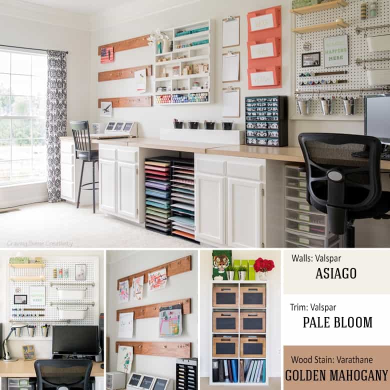
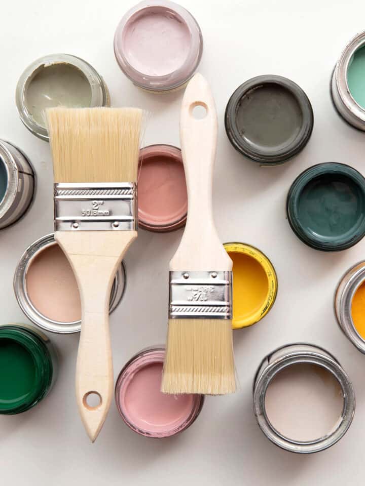
Some of Our Favorite Paint Colors (Many Used in Our Own Home):
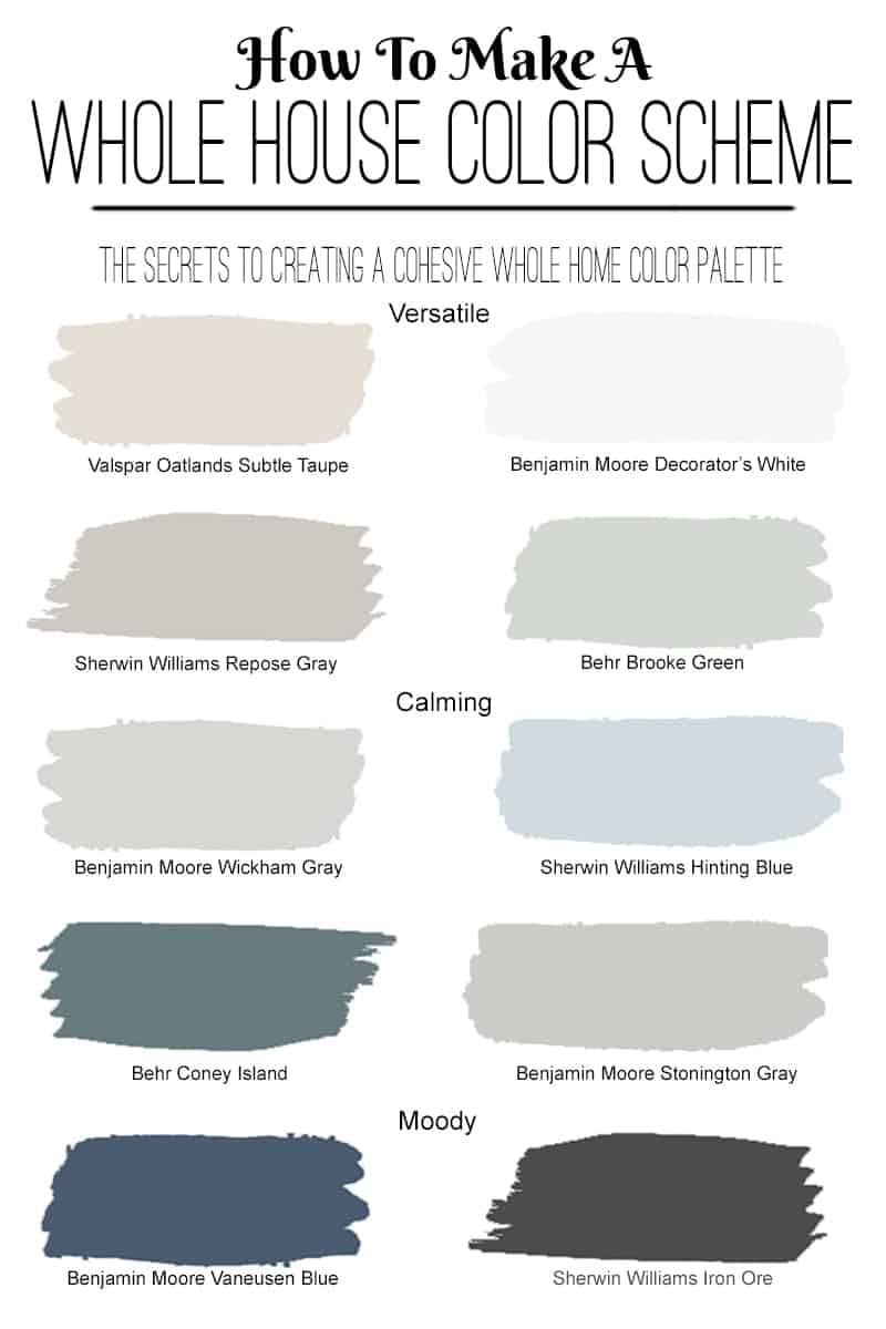
Here is an example of how they work together in our eclectic traditional living room:
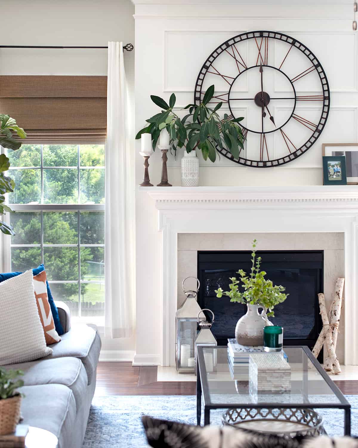
You may notice that our living room, office area, and kitchen are painted similar colors. The fireplace wall above is painted floor to ceiling in our trim color, while the walls are painted Valspar Oatlands Taupe.
What is the Hardest Paint Color To Get Right?
Gray is absolutely the HARDEST paint color to get right. For example, even with my keen eye, it took 3 trips and 12 different samples to paint my laundry room (I got it right though!) I have written a foolproof guide through to picking the right gray paint color that will walk you through it like a pro!
***Pro Tip: Make a book to save your paint information. Save the paint swatch and, if applicable, ask the paint department for an extra bar code label that they put on the paint can. This bar code lists the exact recipe even if you switch stores. Secondly, write down the brand, series, and sheen that you purchased the paint in.
Have Fun with It!
Color is awesome! Do not be scared to see past the white walls or paint everything in lilac if that is what you want. There are lovely colors out there to suit everyone’s taste and personal style. Find yours!
Good luck with all your DIY projects!
Looking for more ways to freshen up those empty walls? Take a look at some of these ideas:
Frequently Asked Questions
When stored properly, a can of paint lasts three to five years. Store paint between 60 to 80 degrees Fahrenheit. Do avoid placing cans on concrete floors, as they rust more quickly. Write on the can the color of the paint, purchase date, and how much paint is leftover.
While cooler colors such as blue and green are making a comeback, whites are still the most popular choice. White can be suitable in all kinds of spaces from minimalist modern to bohemian eclectic. However, whites can be complex as well with varying undertones that determine if a space feels fresh/crisp or cozy/relaxing.
Glossier colors are going to appear deeper and richer than their flat counterparts. When trying a sample, keep in mind that the color often lightens as it dries. Paint samples may appear darker than a swatch just because they are a larger area.
Many manufacture websites such as Behr, Benjamin Moore, and Sherwin Williams have color visualizer tools where you can see how a color will look in a room. However, computer screen differences can make these colors appear different so don’t choose a paint color solely from a photo.
The truth is that there are no rigid rules. However, for a huge open concept space, I usually recommend painting 2 main colors from the same paint card (a lighter color, and another slightly darker but still light shade). This will help with spaces that don’t have as much natural light as others but still look consistent. To those, I usually add 2-3 accents colors, which could be finishes such as wood tones, blacks, or more vibrant colors too.
Grab our free series "Weekend Home Projects that will Transform Your Life" Sign up below to receive updates including free printables, organization tips, home improvement projects, recipes and more! |
More Painting Ideas
PS I love seeing your creations! Be sure to take a photo and tag #cravingcreative on Instagram! You can also stay in touch with me through following me on Instagram, Pinterest, and subscribing to the newsletter!
V Studio says
Semi-Gloss is the perfect color for the room.
Palm Beach County Painters says
Very nice tips and ideas were given in your blog, I really admire your blog.
plants on rent says
Great tips!!! excellent advice for interior decoration,will must follow.
christine says
Great tips for buying paint! Thanks for sharing w/ us at The Wednesday Roundup last week. We are featuring this post this week!!! In addition to our link party, we are also hosting a G+ social media hop.
Alicia says
Hi! I’m in the throes of completing our peer critiques, and I’m checking out the ease of commenting! LOVE your blog, and it’s so beautifully designed- well done! And also: 5 stars on the easy of commenting. 🙂 Always love a good Comment Luv!
Rachel says
I really enjoyed the blog critiques. I still have a lot to work on (when I get time!) I read your blog regularly already because your style is gorgeous and your personality rocks! So your compliments make my day.
Alicia says
Oh my gosh, you’re too sweet!!! And I agree- I have a TON of work to do; I’m pseudo-embarrassed now!!!
Erlene says
Great tips for anyone that is going to be painting. I’ve agree with testing paint on the walls and looking at during different times of the day. We had to repaint because what looked good in one light, didn’t look good in another. Thanks for sharing on Merry Monday.
Rachel says
Thanks for stopping by, Erlene!
Amanda (Moming About) says
I painted 3 rooms with flat paint before realizing I hate it, especially in the living room where we used a really light gray. EVERYTHING shows on it and it’s a real pain in the butt to clean because the paint almost always comes off. Very frustrating!
Rachel says
So true! I learned my lesson about flat paint early on with an apartment painted all in white flat paint. I felt like if I so much as touched it, I left a smudge or scuff. Even if I had a lifetime supply of Magic Erasers, I would never paint a room in flat again. Haha, I know that frustration!
Amanda (Moming About) says
I bought a box of magic erasers, but I haven’t used them yet. White + flat…that sounds AWFUL. I like the flat look and somebody (previous owners) textured the walls and they look like frosting…so the flat helps. However, it’s terrible paint. Terrible.
Jess says
These are such great tips!
Thanks for joining the Link Up this week!
Jenna @ A Savory Feast says
Thanks for the tips! I am going to pin this to keep in mind for my next house. Stopping by from the Weekend Re-Treat linky party.
Rebeccafaith says
This is one of those resources I’ll be frantically searching for when I am going to paint. SO HELPFUL! The eggshell/satin/semigloss alone is a miracle! thanks for putting this together
Emily @ Love, Pasta and a Tool Belt says
What great tips!
Pam@over50feeling40 says
Excellent advice! Thanks for sharing on the Thursday Blog hop!!
Lana says
Thank you – I’m just getting ready to paint my bathroom, and this was all very helpful information!
al says
I love the idea of painting a piece of white cardboard to test colours. I’ve had 5 sample pots sitting on my counter for several weeks but haven’t wanted to put them on the wall until I had a painter lined up. I’m going to paint some cardboard this weekend so I can move it around and see what I like.
Crystelle says
These are very good tips to keep in mind. I have a few swatches taped up on my wall right now, so I need to get myself int he painting mode…. Thanks for sharing!!! 🙂
hugs x, Crystelle